Home › Web Design › Website Layout Types: 12 Grids That Still Work
Website Layout Types: 12 Grids That Still Work
Choosing between website layout types is a content routing decision as much as a brand choice. Your grid can make or break usability as users resize their screens, especially on mobile where most page load requests arrive.
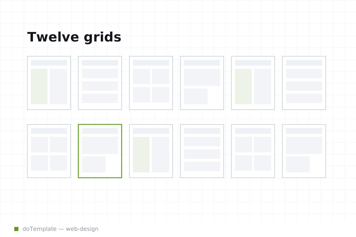
Modern design workflows promote responsive grids—typically at 6 or 12 columns in width—that expand, contract, and reorder as the viewport wobbles. Essential CSS rules like box-sizing: border-box make sure borders and padding change predictably. Grid authors name layout regions with grid-template-areas, which means assigned sections do not have to stick to a fixed order just because that’s how they appear on desktop.
Grids are your tools for content as much as decoration, and most layouts you see are composed in related patterns. Text-heavy pages, especially readings flows like news articles, support an F-pattern reading path through layout. Vertical scrolling pages invite Z-pattern flows, with readers meandering across top and bottom midsections from a focused area at top.
- Single column: A single stretch column, no sidebars to obscure the flow of text and headings as readers lay flat on desktops or hold vertical.
- Sidebar: A single side exact-counterpoint affair or an array of panels that can recede or advance in displays bigger than the article text. Sidebars handle navigations like offering “More by this author” while readers proceed to their own interests.
- Split Screen: Funhouse-mirror layouts, these can split officially or with borders, and have much larger primary and secondary regions across the screen.
- Asymmetric: Nice for landing pages, these layouts downtone familiar patterns and can hold something extra, from an unusually large image centerpiece across all columns, or a heavenly vast white space, to follow a horizontal hero image.
The last conjures more of a mood to inspire designers than marks an authoritative CSS taxonomical class.
Masonry is a layout style of its own, most often seen in image galleries. The box method is to let different sized blocks fill the width of their containing element and allow items to flow to a new row when they reach the end, like text characters.
Card grids use more of a card metaphor. For each card, you group directly related/layout kids into a container and style everything like it’s one card with one purpose. Think about a zillow.com listing, for users perusing dozens of fifty-thousand-dollar layouts quickly. Cards let visitors pop in a new interface, like 3dchsv.com or about.me, and greet them with multiple “cards,” or multiple visual folders, for true information overload.
One intuitive and true insight shines through that marks any exquisite grid: visitors on a phone can still focus their content-comprehension efforts. On a phone, a vertical is never too much to ask, and readers will accept a narrowly justified full-bleed content item. But situations beg questions. How do layouts collapse? Will readers reckon their own order? Is there even a default width they’ll feel reassured by? When scrolling stories or image galleries, ‘more’ can hold an existential meaning.
Clarity is key. They can begin with standard grids, and own some of what’s out there, but will have to modify at least some of what’s out there. Then work back from the responsive file set to barebones to contributing grid-set layers, and maintain that grid setup going forward. Build content first, make yourself repeatedly build grid from the bottom up.