Home › AI & Tools › How to Ask an AI Tool for a Usable Web Page Layout
How to Ask an AI Tool for a Usable Web Page Layout
Improve your chances of getting designs you can actually use by giving your AI tool the right kind of brief.
In this article
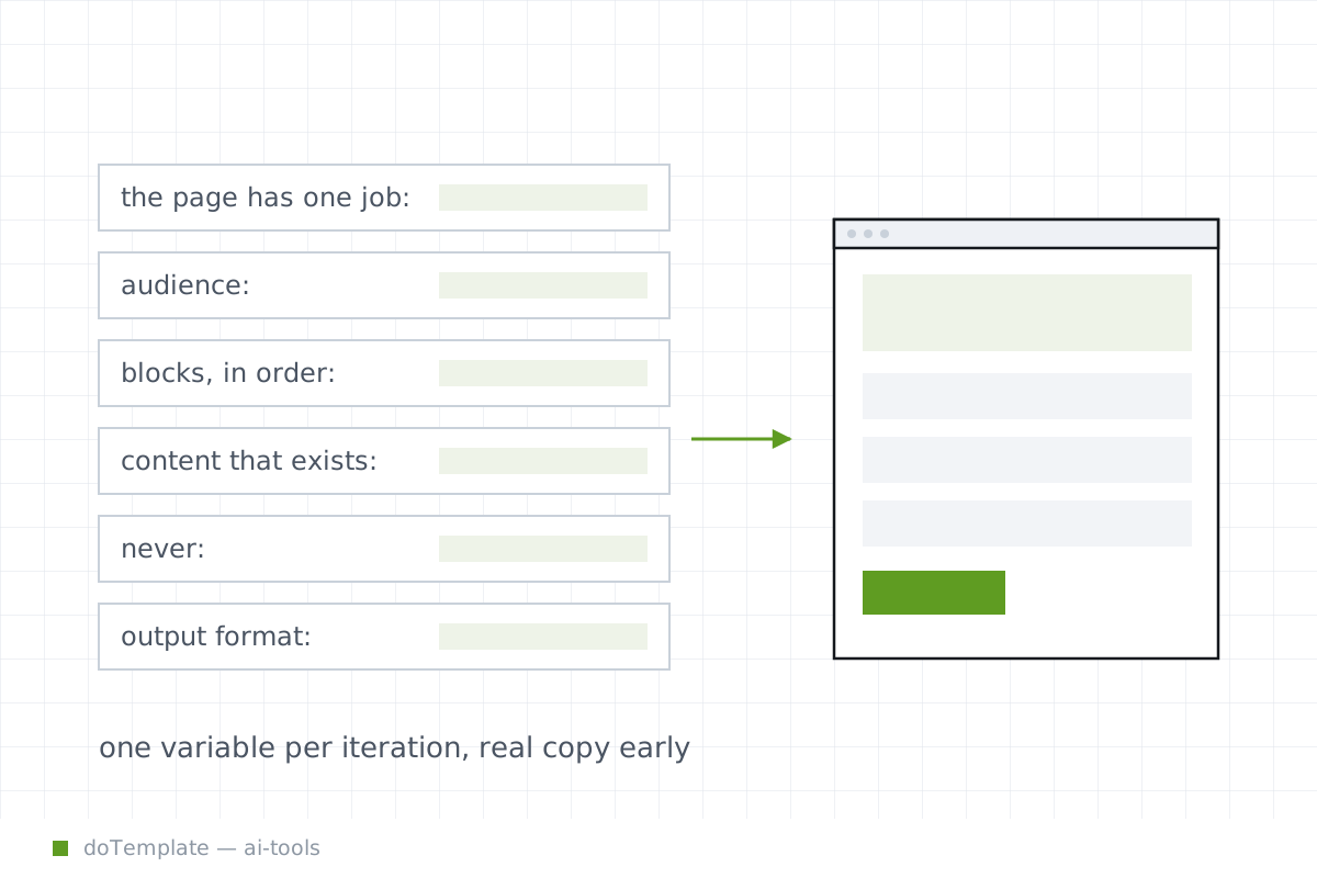
A usable AI page prompt is a production brief, not a style wish. It must specify purpose, audience, real content, ordered blocks, constraints, output format, and revision rules.
What the AI prompt must contain
[A good UI prompt needs screen type, layout structure, key components, target users, visual style, and constraints.] Confusing ‘look and feel’ with the brief doesn’t help. The prompt needs to define the primary goal of the page, the target user, the key content blocks and their order, and how everything needs to fit together.
[A good prompt is a production brief, and that needs to start with the purpose.] The page must do one thing: sell ads, collect email sign-ups, or show a portfolio. Don’t ask the AI to guess what the page is for—say it explicitly.
[Base44 lists the four pillars of a website prompt as purpose, audience, layout, and vibe/design] Start with a prompt that defines the page’s single purpose, specific audience, key content blocks, and page constraints. Those four elements open the design conversation.
[Including the target audience is a best practice that gets consistent.] Define the age, expertise, goal, or vertical field of the page’s audience. That calibrates the layout and font size.
Strapi advises to gather essentials before prompting: content, user goals, business needs, and technical limits. Embrace that “production brief” model.
[Figma’s AI UI Generator lets users define layout, components, and structure in one prompt.] For UI tools, specify which screens to lay out, major system blocks (nav, search, filters), key components, existing banner dimensions, and cardinal versus horizontal orientation (figma’s screen room/browser check).
[Figma says users can prompt again, adjust by hand, or let AI handle layout tweaks automatically.] Don’t let optimisation trump flexibility. Specify that you’re open to tweaks but not to rebuilds.
Why specificity changes the result
[A good prompt is a production brief, and that starts with the purpose.] [Context comes first, and accuracy beats length in AI prompts.] Put the single, definitive purpose of the page front and center. That focuses the results.
[Constraints create quality and define what the AI tool should not do.] List things to avoid, like “No low contrast,” “No smiling spokespersons in offices,” “No carousels.” May all those perils bite the dust.
[Figma says users can prompt again, adjust by hand, or let AI handle layout tweaks automatically.] A prompt that is long on “elegant minimalism” needs to go much further. Say “flat design, lots of white space, large font sizes, product image on the left, button on the right, 1200px view.”
[Strapi gives an example prompt for ‘a SaaS marketing site with customer case studies, testimonials, and dynamic feature sections’] Simply saying “a marketing site” narrows the output set, but not enough. Say “a SaaS marketing site with customer case studies, testimonials from decision-makers, and dynamic feature modules that rotate in from a narrative sidebar.”
When the first draft misses expectation, try saying the same thing, but slightly differently.
See if you can get variants of it by changing one variable at a time: the image size, the button color, the tagline text.
Open it in the design tool and place the testimonial module on your existing layout, and adjust from there.
Then align that copy. See how a short word in a container bloats that container, and goes into the next one, but two longer words fill it just fine. See how a shorter word forces a line break, creating an awkward left edge.
Everyone shows why the original layout accepted the one on the left, but could not fit the short blurb on the right, much less the tasteful field the company logo boxed in. Placeholder indeed.
What to check before shipping
[A page is usable when it does what the initial user goal called for—including accessibility, design, and semiotics.] Only usability counts at the start, and only when the design is unusable.
WCAG 2.1 requires a contrast ratio of at least 4.5:1 The page is not generated unless every interactive element contrasts 4.5:1 at minimum by default. That’s WCAG.
[WCAG 2.1 says all functionality of content must be operable through a keyboard interface without requiring specific timings for individual keystrokes.] Every interactive element—link, button, radio field—is operable by keyboard by default. Sites can leave keypresses locked for additional digital treatments.
That has content order, no empty alt text, accessible attributes, and three keyboard shortcuts.
Rethink manually however you need to. This is how AI-generated design landed.