Home › Speed & SEO › Web Accessibility Basics Every Designer Should Know Before
Web Accessibility Basics Every Designer Should Know Before the Build Starts
In web design, many costly accessibility issues are baked in at the start, when designers lock in color contrast, focus indicators and pointer targets. A first time through the build. How does the web accessiblity toolbox work? And what can a designer actually do?
In this article
Getting tools and basics right is easy; getting systems right, hard. But WCAG 2.2 2024 - the current international standard from the W3C, a voluntary World Wide Web consortium - gives the designer who reads the spec enough to prevent the worst problems from sneaking in.
Color and Contrast Decisions
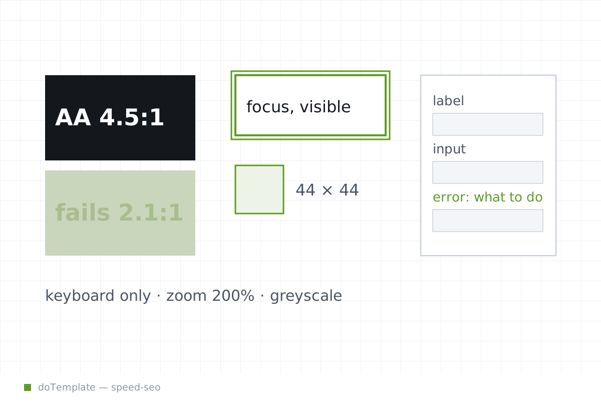
The biggest contrast decisions designers make are for text, interface elements, and images of text. The WCAG 2.2 recommends 4.5:1 contrast ratio or 3:1 for large-scale text. [A few phrases of text examples - decorative? invisble? part of picture? - don't count.]
These requests are practical WCAG standards; not absolute.
Focus and Pointer Targets
The contrast rules are less hard-and-fast with focus and pointer targets.
The focus indicator that gets painted on screen takes 2 CSS pixels with 3:1 contrast. It can't get hidden by anything on the web page designer's screen. That minimum 'dot' of a focus area defines how important or how interactive an object can be to mice and touch devices - rule that its essential presentation or requirement defines the same.
The key difference is that focus suggests action. Pointer targets create click suraces that make things happen. The newer WCAG 2.2 puts the target size at 24x24 minimum, but has exceptions in the note.
Automatic motion needs a user stop or pause or hide unless the design marks it essential. People get confused. The content can crowd the accessible page.
How WCAG 2.2 Means in Practice
None of these rules is a check box, stand on its own. If WCAG to a designer is checkboxes, then focus, color, and attention problems will sneak in. What to do? A way in is self-contained tests before the build. Not beforehand—makes sense. Avoids hardcoded work, on screen.
Grayscale version. Keyboard-only view. Scale to 200% zoom.
These deliberate choices hardwire some good habits from the start and warn you when choices go wrong.
The tests won't tell you that every line within every heading or label works smooth for an accessibility screen reader or if the button is labeled 'info content' and spells 'unknown'.
But anybody has good intentions. With this sort of tools and habit, a designer will avoid most of the hard hitlists that disable real builders from getting WCAG certification.
The Legal Pressure
That hard-wired check on the designer's desk started life from jursidiction-specific legal action, nothing hard-wired to WCAG. The US was the first driver; but by 2023 and the publication of WCAG 2.1 and 2.2, EU states were catching up, mid-sized enterprises migrating there were doing compliance:
In the years since 2.2, most places and regulations now give a deadline: sanitize your site to the AA level of WCAG.
For designer, though, that's just a political wrapper around the design inputs they've now hard-wired; good intentions, deeper accessible check.