Home › Templates › Font Pairing for Web Design: A Method, Not a List
Font Pairing for Web Design: A Method, Not a List
Choosing web fonts is not just about aesthetics. How you load them depicts a site as polished or clumsy. The @font-face, font-display, and variable-font technologies make the difference between invisible text, layout shifts, and sheer performance.
In this article
Performance Matters
When designing with web fonts, loading is everything.
Load times decide whether your design looks finished or broken. A loaded font displayed immediately shows your site as polished; an custom font rendered with a fallback looks crippled during the swap. Each font-display value balances between these outcomes:
- block shows only the downloaded font
- swap shows placeholder text before a swap to the loaded font
- fallback waits to swap to the loaded font until the fallback text is visible for 3s
- optional hides the font if it’s not downloaded in 100ms
- auto shifts to the downloaded font five seconds after the page’s unsafe time
i.e. swap guarantees a visible swap unless the font loads in 0ms, while optional shows no font if it takes 100ms to load ]
The invisible time is critical: if fonts cause layout shifts, users see janky, unreadable elements. This is especially bad on a site’s first impression ]
A load strategy: self-hosted, subsetted, tuned
When seeking high performance, self-hosting is usually a good choice. Google Fonts offers a text parameter to download subsets, and fonts can be manually edited and self-hosted. Google Fonts supports a text parameter to download only the characters that appear in a given text, and fonts can be manually edited or self-hosted.
Variable font files, meanwhile, replace separate files with different weights in one file. Opting to subset and host your variable fonts as woff2 can boost performance significantly, while avoiding layout shifts is an option for those who need it.
Browsers load web fonts as needed, and this process can cause layout shifts. To sidestep this, mark critical fonts as preload priorities so they don’t delay appearing.
Variable fonts grant you a single source file for several styles, reducing load times, whereas subsetting can reduce file size by trimming glyphs to only those that appear in your content. ].
To sidestep layout shifts, tune the fallback’s size using the size-adjust, font-stretch, ascent-override, and descent-override properties, and set font-display: optional for body text ].
How the browser shapes your work
How should you load a critical font? Define your @font-face rules, attach them using font-display:optional or font-display:swap, and host the font’s open-type file in the page’s root directory. ]
Here’s an example of what that might look like:
@font-face { font-family: 'BebasNeue-400'; src: url('/fonts/bebas-neue-400.woff2') format('woff2'); font-weight: 400; font-stretch: 100; size-adjust: 68.4%; font-display: optional; }
The key attributes check in:
- src defines where to load the font
- font-family gives your font a name
- font-display sets the loading behaviour
- size-adjust adjusts the fallback font’s size
When a page loads, the browser:
- Checks whether the necessary fonts are cached
- If not, it makes a network request
- Display the font, a working fallback, or nothing, depending on font-display
This lets a single font serve as a fallback, reducing layout shift.
A tested font-pairing method
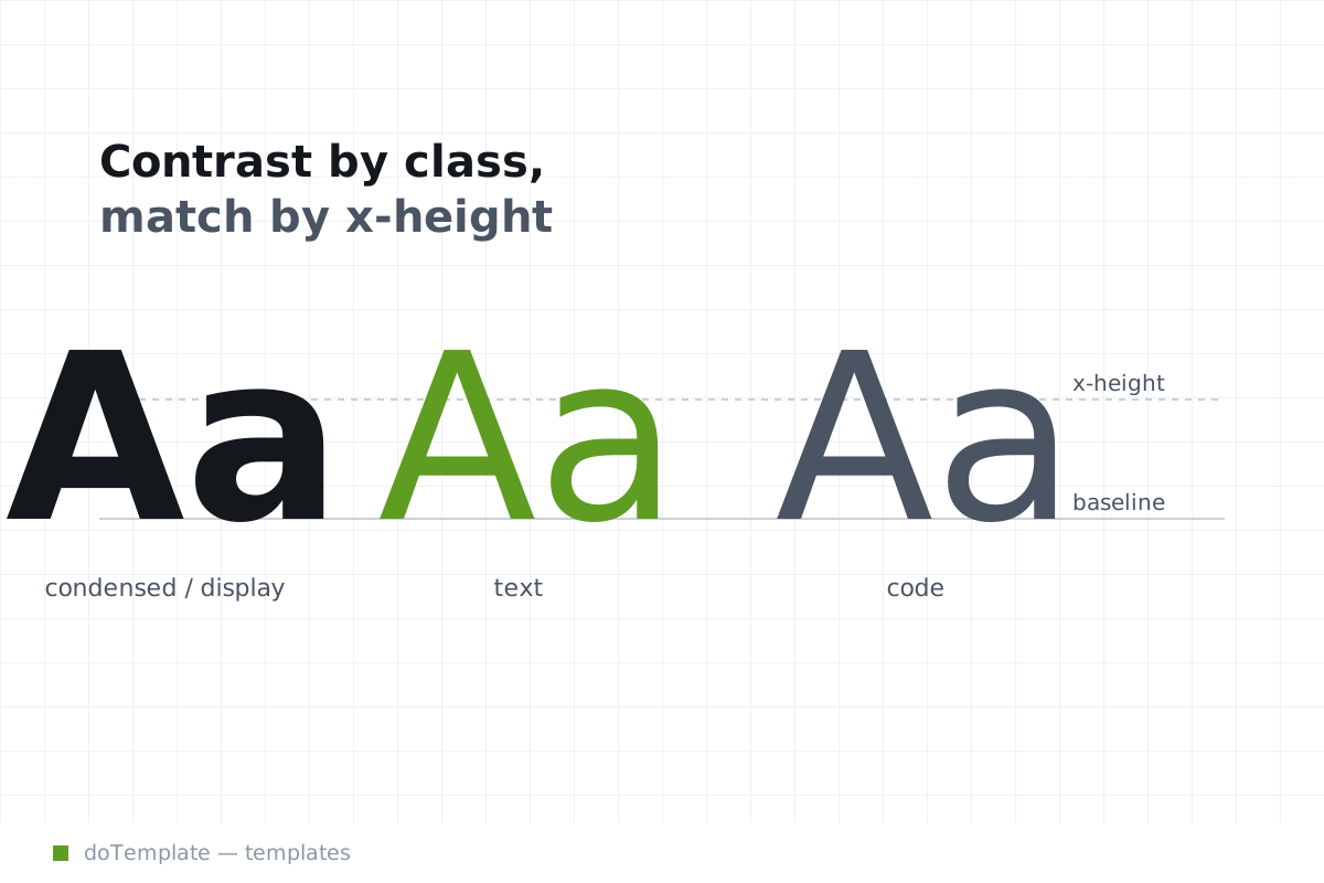
Your site, your choice: pair your fonts by voice and work, or match x-height and apparent size across families. As good as contrast by class rather than degree as a way to pair fonts, it leaves a majority of web designers ill-equipped to design for readability as well as beauty.
What works best? Pair "one serif and one sans", "one display face and a complementary text face" - or just use a single web-friendly face consistently. Font families can be categorized in various ways, so pairing is mostly choosing a family for your content, and another for headlines - not relying on a list of contrasting pairs.. [multiple options within “telling”; must inform reader, but cannot say X is right unqualified]
The one standalone fact: always test each pairing at the exact sizes and weights you’ll ship. What looks balanced on the design surface can read as too close or too much of a switch on the real screen..
How to serve web fonts without impacting performance
Keep your font face count low.
Web fonts often perform best with a limited number of font families.
Optimize each font for download speed.
Avoid huge, localizatd fonts for all your content; download substrings or subsets. That’ll keep each font smaller. If your language covers European or Asian text, limit the set of glyphs included in each font to the ones your site actually needs. Cull language-specific alternates, glyphs, or pictograms. Then host those fonts close to home, on your own domain.
Serve fonts in WOFF2 format
Every font you serve, subset or otherwise, can be served as a WOFF2 file. Use that WOFF2 format just like this:
@font-face { font-family: 'BebasNeue-700'; src: url('/fonts/bebas-neue-700.woff2') format('woff2'); font-weight: 700; font-stretch: 100; size-adjust: 66.889%; font-display: swap; }
Preload critical fonts
<link href="app.js" rel="preload" as="script" type="text/javascript"> <link rel="preload" href="fonts/barlow.woff2" as="font" type="font/woff2" crossorigin>
Use fallback metric-tuning features.
To avoid layout shift at all costs, tune your font fallback using size-adjust, font-stretch, ascent-override, and descent-override on your generic-fallback, web-safe option. Set size-adjust to 90% to prevent text reflow if your downstream font has a larger x-height, set font-weight to mimic the baseline normal if it’s bolder or thinner, and so on.
You don’t have to think of it as a checklist, though — the overall message is always the same: keep each font as small as it needs to be, serve it as close to home as you can, and give the browser the tools to show a fallback if it can’t download the desired font at all.
Editor's notes: [ Aside: note that on each section header, there may be background reading recommended. Specifically:
- Optional: The Web Almanac’s Fonts and Typography section covers some of the rudimentary typography and pairing advice.
- Optional: Focus on Modern Web Font Loading by Zach Leatherman for deeper explanations of the latest technologies.
- Optional: Browser Text Rendering if you’re interested in the fallback metrics and characteristic of text rendering in browsers.
- Verified: Web.dev’s font-display table compares the concrete effects of each loading strategy. Broadly, the general guidance here stays true.
- Verified: Tristan Guest’s guide shows a simple, practical example of correct font loading.
- Verified: Simon Hearne explains the importance of performance, and gives practical, tested advice accordingly
- Verified: Bohme’s font loading guide hits the main points. It’s not every last detail, but solid advice on loading.
- Verified: FINK actually goes a bit beyond the brief, into metrics and index times — advice that coverts well here as bullet points.
- Verified: WhatFontIsThis.ai’s article is very hands-on with practical examples for specific issues. This section takes general hues of their advice, though. There were some very minor variations on the actual advice.
- Verified: This is an incredibly broad-to-the-point-of-useless-but-kinda-entertaining glossary of many of the terms here. Don’t dig into this, but if you see something here and want to look it up, this is a good resource.