Home › AI & Tools › Keeping Your Web Design Fidelity in the Handoff to HTML
Keeping Your Web Design Fidelity in the Handoff to HTML
The design-to-HTML handoff can be dicey: Content management, metadata, responsiveness, and asset management drift into the margin. While design tokens become custom properties in CSS, and images must have fidelity-preserving aspect ratios to stay true to the mockup.
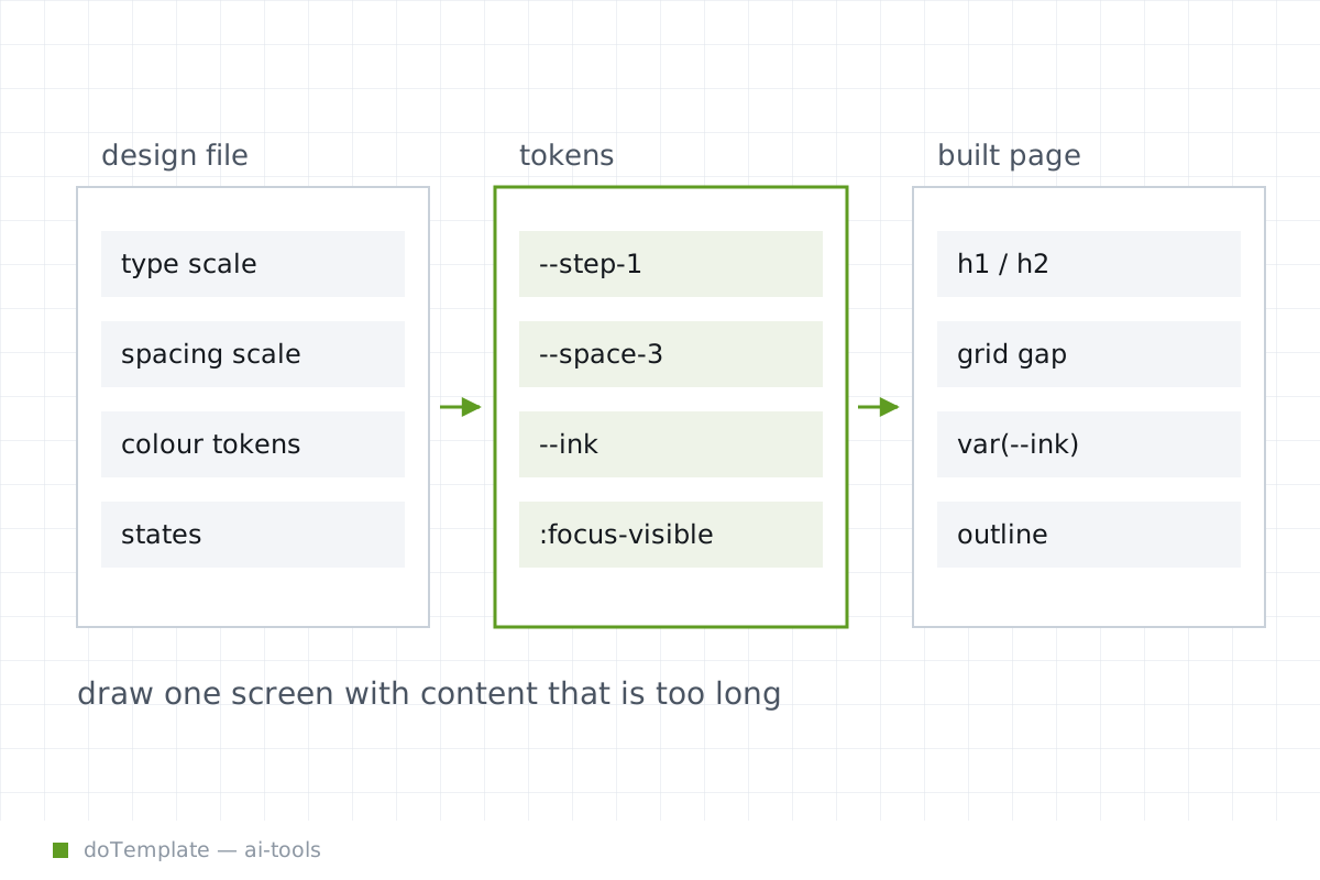
Design tokens save time and reduce inconsistency on the team. They can represent typography, color palettes, spacing and more, providing a dictionary of transposable abstract values. Where these tokens are emitted to the stylesheet as CSS custom properties, concrete application begins.
The --foo approach to CSS gives a place to catch every reusable variable based on the design, such as colors and spacing. Design tokens emitted as CSS variables can take different names in the HTML, and these CSS custom properties are scattered across stylesheets by their appearance in real code.
This does not mean every value is a true custom property, however. Mapping tokens and properties, even with the most powerful design-to-HTML tools, leaves scope for different names. These CSS variables define the semantic placeholders designers explore, not the fixed scale they instruct.
This is one sharp edge in a handoff where "CSS token mapping" sounds like a nerd phrase but actually means "what text goes where." In reviewing a finished HTML feature, search for a color token name like text-color-primary and see if it maps correctly to the intended CSS property.
You don't have to do this. The nerds are trying to tell you something.
Imagine an image that has the aspect ratio of one by one. In one part of the app it’s a square. Then you find it stretching to fit into a two-by-one rectangle. Where were those aspect ratios?
Developers run into this issue with images all the time.
Images — img elements — have an intrinsic size and aspect ratio that make them act as they do. They try to stretch to fit their container by default. You won’t change that unless you set aspect-ratio, object-fit, or object-position. These properties do what the name says, but don’t levitate you out of the necessity to define their target size in the container.
In practice, any image that is not resized by some other CSS property will be shown at its intrinsic size, unless you do something special. Usually this is not an aspect ratio – object-fit: contain or object-fit: cover. One of these will make the image fit in its box, but do it in a different way.
Reviewers have to fight the fumbling of image edge cases. Designers throw the individual instances to the developers, but the sizing of these images — their proportion, their cropping and placement within the box — is a design decision. The symbol here is the zoomable screen, only showing actual real content, but showing it on two responsive breakpoints at once: one wide, one narrow. Let real content be the constant in the scrolling real-estate change.
This content review session goes like this:
- Find the rigid layout screen from the mockup in the user flow.
- Lay it alongside content overflow and more content screens.
- Check the UI elements for interaction states, content-alignment, accessibility-focusing, error handling and disabled state.
- Get crisp about the slightest visual difference and record it.
Designers still shouldn't rely on unchecked browser default behavior, especially for images. Handing over any web content without aspect-ratio and object-fit rules is, in this sense, handing over the design decision to the browser.
The builders can’t deliver a web feature pixel-perfect without design for aspect ratios, interaction states, and content-cropping. Nothing guarantees an image’s aspect ratio until it’s explicitly set, and object-fit only works when you’ve sized the container it’s in. Review your next handoff next to the duplicated 2-width screenshot and capture those differences.