Home › CSS & Code › CSS Container Queries: A Practical Guide to Responsive Des
CSS Container Queries: A Practical Guide to Responsive Design
CSS container queries are revolutionizing the way developers approach responsive design. Rather than relying on media queries that adjust based on viewport size, container queries allow you to style components based on the dimensions of their container. This subtle but powerful shift enables components to adapt to the space they are given, rather than the overall page size.
In this article
Traditionally, web layouts have been designed using media queries to adjust for different viewport widths. However, this approach has limitations, especially when dealing with components that need to be reused across different parts of a page.
Enter container queries, which allow you to define styles based on the size of a specific container element, rather than the entire viewport. This element-based querying system, as defined in the W3C CSS Containment Module Level 3, provides a more granular and intuitive way to create responsive components.
Why Media Queries Fall Short
Media queries, while powerful, often fall short when it comes to component-level responsiveness. They are inherently tied to the viewport size, which means that a component's style may not adapt correctly when placed in different containers across a page.
Media queries are-semantically tied to the user agent or device environment, not the document's internal elements. By contrast, container queries are evaluated against the queried container's size and apply styles to the elements within that container if the condition is true.
This fundamental difference means that container queries are better suited for creating reusable, responsive components that can adapt to their environment.
Declaring a Containment Context
To create a containment context, an element must use the container-type property or the container shorthand to define its function as a size-query container. The container-type values can be size, inline-size, or normal, depending on the axis of the query. The W3C Containment spec defines this behavior.
Example:
 container-type: inline-size;
}
This CSS establishes the .container element as a query container that evaluates styles based on its inline size.
How @container Finds What to Target
The @container at-rule applies styles to a containment context. By default, the closest unnamed container is targeted. However, for more precise control, you can assign a container-name property to a containment context and then target that name in your @container rule.
Example:
 container-name: my-card;
 container-type: size;
}

@container (name: my-card) (max-width: 500px) {.card-content {
 display: grid;
 }
}In this example, the .card-content styles are applied when the my-card container's width is 500px or less. The named container allows for clear and maintainable queries, especially in complex layouts.
Size vs. Inline-Size and Container Query Units
When establishing a size-query container, you can choose between size, which considers both width and height, or inline-size, which only evaluates the inline axis. This decision can impact how your components adapt.
Example:
/* Width and height-based container */.size-container {
 container-type: size;
}

/* Inline-size container */.inline-container {
 container-type: inline-size;
}
Additionally, container queries introduce new CSS units like cqw, cqh, and cqi, which represent 1% of the container's respective dimensions.
Example:
@container (inline-size > 700px) {.card-content {
 padding: 20cqw; /* 20% of container width */
 }
}
These units provide a flexible way to create components that scale predictably within their containers.
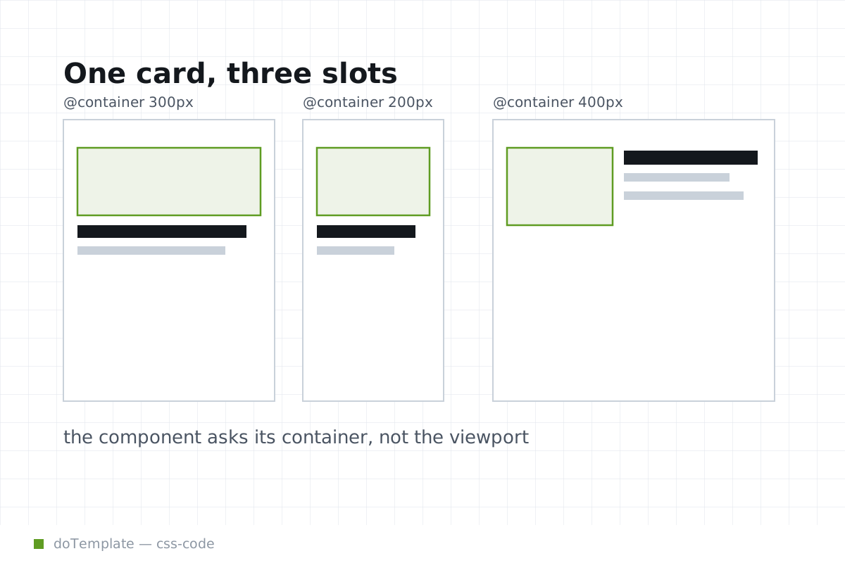
Card Layout That Flips at the Container Boundary
You can make a card component change layout when its container gets narrower, instead of when the viewport changes. This is a practical example of how container queries enable more granular responsive designs.
Example:
 container-type: size;
}

@container (max-width: 500px) {.card-content {
 display: grid;
 }
}

@container (min-width: 501px) {.card-content {
 display: flex;
 }
}.card {
 height: 100%;
}
In this example, the .card-content switches between grid and flex layout based on the container's width. This enables the card to adapt to its environment, providing a consistent experience regardless of its placement on the page.
Common Pitfalls and Best Practices
While container queries offer powerful capabilities, they come with some considerations:
- Avoid Nesting: Be mindful of nesting containers, as it can lead to unexpected matches. Always name your containers to maintain control over your queries.
- Avoid Element Sizing Iterpretation: Remember that query expressions are evaluated against the descendant elements, not the container itself, to ensure that the container will size itself from its contents.
By following these best practices, you can write more efficient and maintainable container queries.
Conclusion
CSS container queries represent a significant development in responsive design. By enabling styles to adapt based on an element's container, not the viewport, container queries offer a more intuitive and maintainable approach to creating flexible layouts. As browser support improves and specifications mature, container queries are poised to become an essential tool for modern web developers, paving the way for more adaptive and reusable components.