Home › CSS & Code › CSS Grid vs Flexbox: A Decision Table That Ends the Argume
CSS Grid vs Flexbox: A Decision Table That Ends the Argument
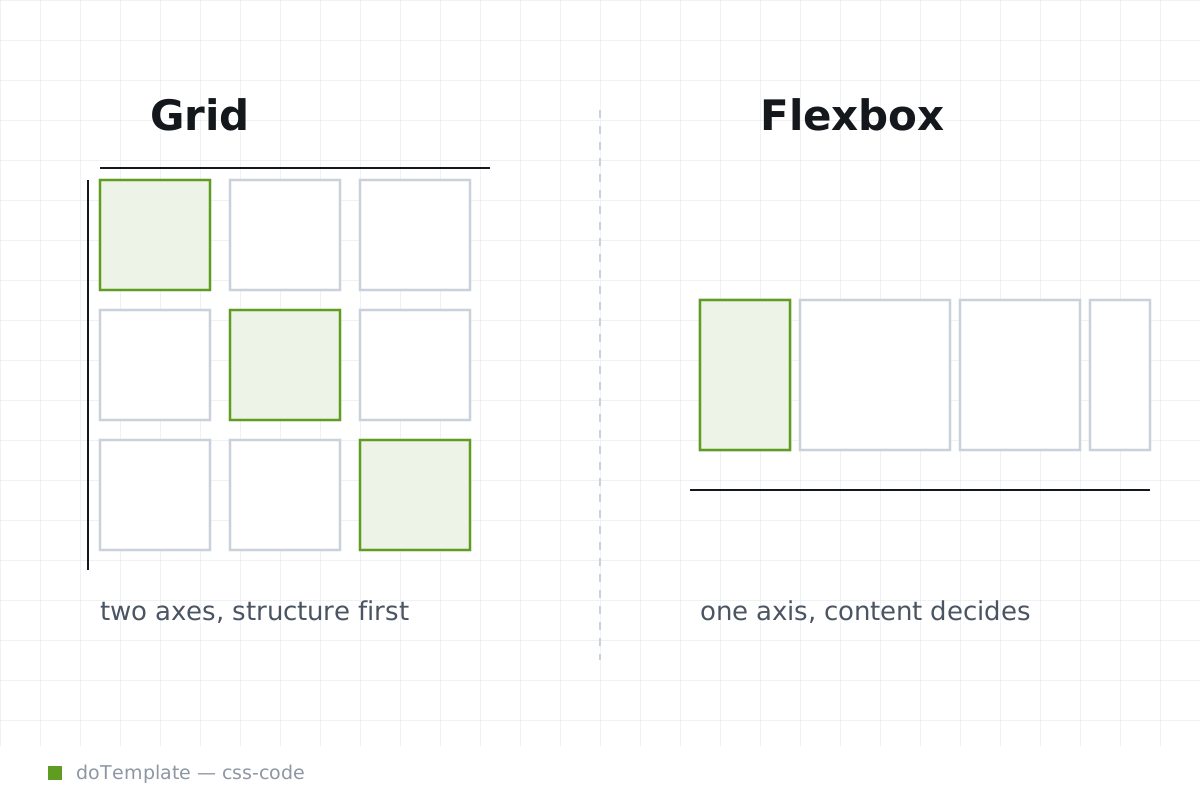
Between CSS Grid and Flexbox, the choice often comes down to the axis of the layout. Flexbox arranges items in a single direction, ideal for components in rows or columns, while Grid creates a two-dimensional layout, perfect for more complex arrangements.
In this article
Think of Flexbox as a tool for aligning content within an element (axis: horizontal or vertical), while Grid builds the structure that holds the content (axis: both).
Default to Flexbox when your layout is linear: a horizontal nav bar, a vertical list of items, or aligning media with text. Use Flexbox when the component's size is driven by the content, not just the structure. The CSS-Tricks guide on Flexbox use cases lists several patterns that reveal Flexbox as a go-to for content-driven layout.
Default to Grid when you need a two-axis layout. Card decks, photo galleries, page shells, and other containers with aligned rows and columns all work best as grids. Grid also excels at layouts based on line boxes, like tables and forms, where you define both row and column dimensions.
Cases Where Flexbox Wins
Flexbox is the right tool for components that need two or more elements in a single row or column. Its simplicity shines in simple layouts, especially when content size rules.
Example layouts where Flexbox is preferable:
- Navigation bars: A horizontal nav bar is a classic use case for Flexbox. Set the items to flex throughout the nav.
- Media Objects: Row-based media objects, where the media sits beside a block of text, can be set with Flexbox if you're working within a single row.
- Forms: Form layouts follow Flexbox’s row-based approach when they want content-driven row size.
- Uneven Sidebar Elements: Flexbox’s ability to handle different content lengths in a single line of layout makes it a good choice for sidebars.
- Buttons: Flexbox simplifies centered buttons with uniform or content-driven sizes.
- Wide Grid Components: Two-column grids can work in Flexbox, but it’s less efficient for patterns that need multi-column management.
Cases Where Grid Wins
Grid wins when you need to manage a two-dimensional layout. Its defining feature is customizing both rows and columns, and defining the structure before the content.
Example layouts where Grid is preferable over Flexbox:
- Card Layouts: When a container holds items of the same size, creating a grid instead of a Flexbox can be more efficient.
- Tables: Two-dimensional tables are best laid out with Grid. Responsive tables are built with Grid, too.
- Forms: Form rows can be set in a Grid, and Grid's auto-fit fill allows for inputs to share available space.
- Full-Width Page Layouts: Two-column page shells, for instance, and other two-axis layouts.
- Uneven galleries: Using Grid patterns with
auto-fitandminmax() - Uneven Cards: When card sizes differ based on content, which is common in card organizers, then Grid is the choice.
The Two Common Traps
With shared terminology like gaps and auto-sizing, it’s easy to get Flexbox and Grid mixed up. Flexbox containers get gaps, but so do Grid containers. The difference is how the gaps work.
Flexbox’s gap property defines space between the flex items in a flex line, and between flex lines. Grid’s gap also sets space between items, but it considers the grid as a whole: it sets space between columns and between rows, creating a more boxy division. In Flexbox, gaps are more content-driven; in Grid, they’re more structure-driven.
The auto-fill versus auto-fit decision is Grid-specific, and it’s another variable to consider. auto-fill makes as many tracks of a set size, leaving empty ones on the layout if the container is small, and auto-fit makes the empty tracks collapse as the container grows.
Remember, Flexbox and Grid are not independent—they can nest. Grid items can act as flex containers, and flex items can act as grid items. The rule here is to let the layout axis guide the container choice, not your framework of choice or a one-size-fits-all rule.
How They Work Together
It's time to shake off the idea that CSS Grid and Flexbox are rivals. Instead, think of them as complementary tools. You don't have to choose one over the other; in fact, the most effective layouts often use both.
Grid excels at laying out the overall structure of a page, defining rows and columns that can stretch and contract as needed. Within those grid items, you can use Flexbox to align and distribute the content. This approach combines the strengths of both systems, allowing you to create complex, responsive layouts that adapt to different screen sizes and content types.